Background
Approach
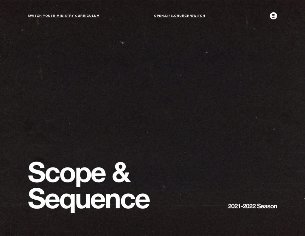
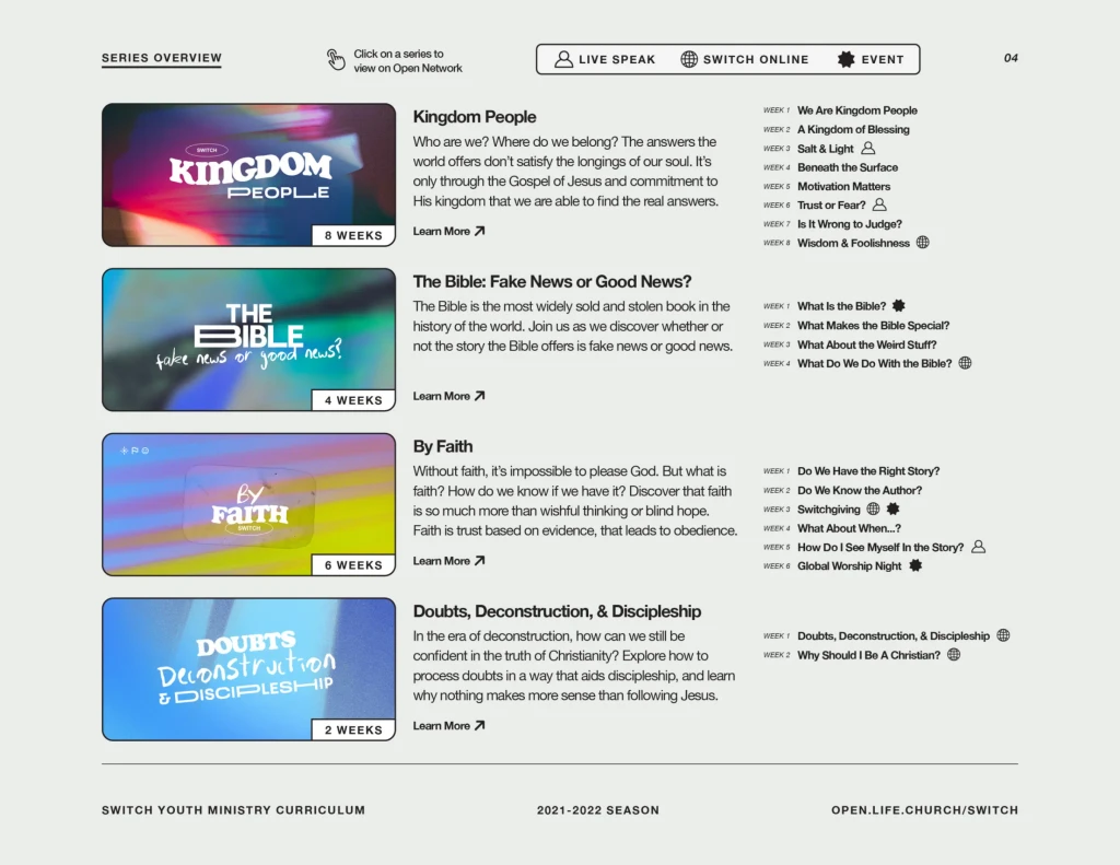
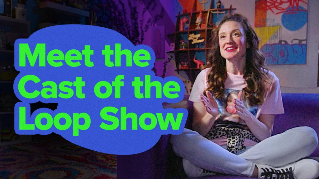
Each curriculum needed to be an fitting extension of the existing LifeKids brands, while at the same time creating a unique visual language to be used across the new resources being created. The use of shapes as consistent visual elements felt perfect for the preschool and elementary curriculum, while gradients, textures, and real-world imagery better spoke to Switch's older audience.
